
Case study: Brand development
Tech Hub
A ''few signs'' became something much bigger.
Client
Reaseheath College
Industry
Engineering
Year
2025

The challenge...
Reaseheath College asked us to design signage for a new technical learning space. Looking beyond the immediate brief, we saw an opportunity to give the Tech Hub a recognisable identity — one that connected the facilities with practical skills, industry and students’ futures.
The space brought together specialist equipment and new opportunities for learning. But signage alone couldn’t explain its value.
The challenge was to make the Tech Hub feel like a destination: somewhere students could see the connection between what they were learning and where it could take them.
What we did
We explored the purpose of the space, how people would use it and what it needed to communicate.
From there, we developed a bold visual identity and a clear campaign idea: **Your future. Engineered here.**
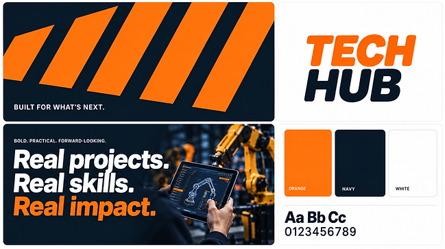
Strong typography, orange and dark navy, and a distinctive diagonal graphic created a practical, recognisable visual language. Images of technology and hands-on learning brought the message to life.
We extended the approach across signage, posters, publications and promotional materials, giving each application a consistent look and purpose.




The difference it made...
The Tech Hub gained a clearer identity and a more coherent presence across campus and recruitment communications.
The work gave the college a way to explain the opportunity behind the equipment — connecting specialist facilities with real projects, practical skills and future careers.
What began as a request for signs became a platform for promoting the whole learning environment.
